← Back to CSS
22

Web typography: the variable font shift

Improve performance and typographic precision by using one font file for many weights, widths and styles.

📘 Theory

Variation axes

One file, many controlled outcomes.

1

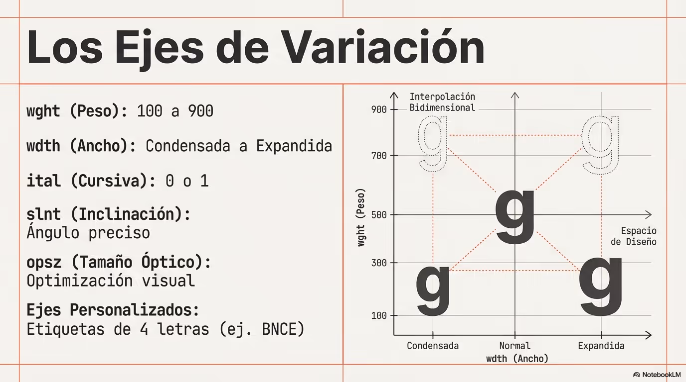
With a variable font, you are not limited to coarse steps such as 400 or 700. If the design needs it, you can set a weight like `532` and get a more exact visual result.

2

Common axes include `wght` for weight, `wdth` for width, `slnt` for slant and `opsz` for optical size.

3

You can access them through `font-variation-settings`, although some of them are already mapped to familiar CSS properties such as `font-weight`.

Icons treated like text

Typography thinking can improve icon workflows too.

1

When icons behave like font glyphs, they stay vector-sharp and inherit text-related styling much more naturally than a bitmap asset ever could.

2

That means you can adjust color, size or even subtle typographic rhythm with the same CSS patterns you already use for labels, headings and buttons.

A practical alignment formula

Small offsets often separate a polished interface from one that feels slightly off.

1

Inline icons often look a bit too high or too low relative to surrounding text, even when the code seems technically correct.

2

A helpful method is to estimate the line box height with `font-size * line-height`, compare that value with the icon size, then divide the difference by two.

3

That gives you a sensible starting offset for `translateY()` or margin tuning, which is especially useful in buttons, navigation items and compact cards.

Performance considerations

More capability still needs disciplined loading.

1

Variable fonts are often more efficient than shipping many separate files, but they should still be chosen intentionally. Load only the families and axis ranges that the product really needs.

2

Use strategies such as `font-display: swap` so text stays readable while the font is loading, instead of blocking the render path for a decorative preference.

🧭 Key visuals

Variable font axes

Use this visual to understand how each axis changes the same typeface without switching to another file.

Diagram showing variable font axes such as wght, wdth, slnt and opsz and how they affect the design.

Building an icon font from SVG with IcoMoon

It fits this lesson because it connects variable typography, icon fonts and a realistic asset workflow.

Visual workflow for creating an icon font from SVG files in IcoMoon

🧪 Learn by doing

Example Demo: fine-tuning weight Try a non-standard weight value to see how smoothly a variable font can respond.
Example Challenge: align the icon cleanly The text is 16px with a line-height of 1.5 and the icon is 20px tall. Calculate the vertical adjustment and apply it with a transform.

🧰 Resources

What is this?

I'm Cristian Eslava and I sometimes build websites so both you and I can learn and experiment. culTest

I made this in February 2026 to make learning easier for my students. The idea is to learn web development by practicing and to keep expanding the project with new topics, tests and challenges.

It draws inspiration from MDN, W3Schools, CodePen, Manz and many other web development references. I wanted to combine useful theory, runnable examples, challenges and the testing system I had already built for culTest. culTest

If you liked it, if you didn't, or if you want to get in touch, write to me at cristianeslava@gmail.com